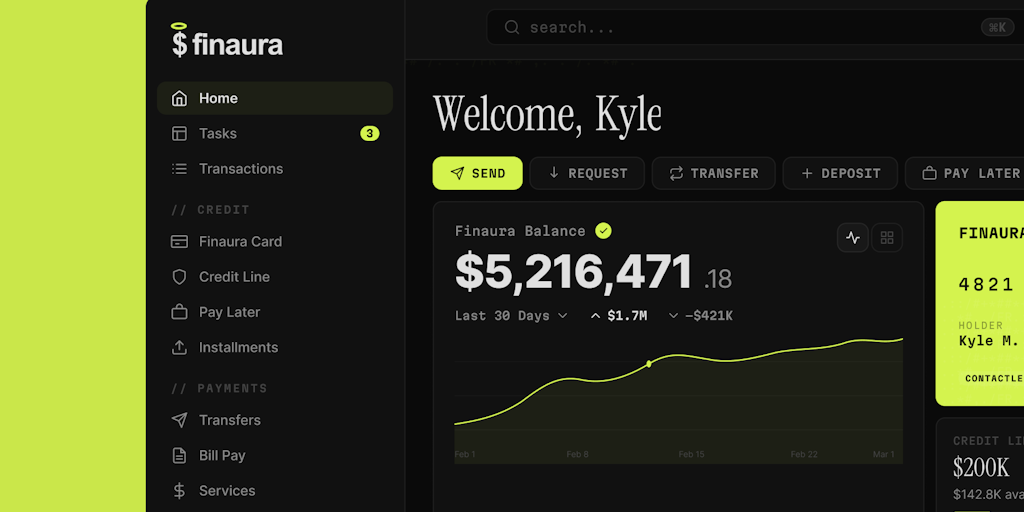
Finaura is a premium fintech dashboard UI kit meticulously crafted for fintech startups, neobanks, and modern SaaS platforms. It provides a refined finance dashboard with 60 ready-to-use screens that span every core banking flow—from onboarding to analytics—giving teams a production-grade foundation to build upon. The kit's cohesive visual language, which pairs editorial serif headlines with monospace data typography, along with a comprehensive design system, accelerates development while ensuring a distinctive, premium aesthetic that stands apart from generic dashboards. This combination of breadth and polish makes Finaura an essential resource for any team looking to launch a fintech product quickly and confidently.
Many fintech products struggle to balance visual distinction with functional completeness. Generic dashboards fail to convey trust, while overly complex designs slow down development and introduce inconsistencies. Finaura addresses this dual challenge by providing a meticulously organized set of screens that cover the full user journey—from authentication and onboarding to detailed analytics and account management. Designers no longer need to patch together disparate templates or build common flows from scratch. Instead, they have a consistent, production-ready toolkit that saves weeks of iteration and ensures every interaction aligns with modern banking expectations. The result is a polished interface that builds user confidence from the first screen.
The first major feature is the comprehensive library of 60 ready-to-use screens. Finaura covers authentication screens (login, signup, forgot password), a home dashboard with balance overview and credit card widget, task management, transaction history with detail views, and dedicated screens for card management (freeze/unfreeze, PIN change, spending limits, card replacement). Transfer flows include domestic, international, and scheduled transfers, each with clear confirmation screens. Bill payment screens support auto-pay setup, and the product also includes connected services, pay later, and installment plan detail views. This breadth means that designers can prototype an entire neobank or fintech app in days, not months, using screens that are already pixel-perfect and logically connected.
The second major feature is the distinctive typographic system. Finaura employs three premium fonts: Instrument Serif for editorial serif headlines, Martian Mono for monospace data typography, and Inter for clean UI text. This curated combination creates a visual language that feels both sophisticated and trustworthy—qualities essential for financial interfaces. The fonts are selected to work harmoniously together, with the serif adding character, the monospace reinforcing data precision, and the sans-serif ensuring readability across all screen sizes. Additionally, a complete design system page documents every token, atom, molecule, and organism. Colors, typography scales, spacing, and icons are all defined with clear naming conventions, making it trivial for teams to extend the kit while maintaining visual consistency. Developers receive a single source of truth, reducing misinterpretation during handoff.
admin
A third feature group covers card management, transfers, and credit products. Card management screens allow users to freeze or unfreeze a digital card, view and change the PIN, set transaction limits, and initiate a replacement. Transfer screens cover domestic and international wire transfers, scheduled transfers, and recurring payments. Bill payment screens include auto-pay configuration and payment history. For credit products, Finaura provides credit line overviews, pay later screens with repayment schedules, and installment plan detail pages. These features directly implement common fintech requirements, providing ready-made UI that communicates functionality clearly. Each screen is designed with the user's mental model in mind, reducing cognitive load and ensuring that even complex financial operations feel straightforward and accessible.
The overall workflow for using Finaura is simple and efficient. The product is delivered as a single Figma file (22 MB) with all screens organized into logical pages: authentication, dashboard, transactions, cards, transfers, bills, credit, analytics, settings, and more. A dedicated design system page lists all tokens and components, enabling teams to understand the visual architecture at a glance. To use, designers open the file in Figma, browse the screen library, and copy relevant frames into their project. Because every screen uses the same style guides and components, customization propagates consistently. Fonts (Instrument Serif, Martian Mono, Inter) are available from Google Fonts and are included in the file. The kit is designed for Figma, leveraging its component and auto-layout capabilities for responsive scaling. This approach minimizes the gap between design and development, as developers receive a well-structured, production-ready file.
Concrete use cases demonstrate the kit's versatility. A fintech startup building a neobank can use Finaura to prototype the entire user journey in days—from login to account settings—and present a convincing demo to investors. A product team designing a budgeting app can leverage the expense analytics screens (income vs. expense charts, financial goals, spending breakdowns) to visualize users' financial health without building charts from scratch. A SaaS platform adding payment features can adopt the transfer and bill payment flows to accelerate launch, while ensuring a consistent user experience across web and mobile. In each case, the outcome is a cohesive, professional interface that builds user trust and reduces time-to-market by weeks. The kit's breadth means it serves both early-stage MVPs and mature product iterations, adapting as the product grows.
Finaura is primarily designed for UI/UX designers, product designers, and design teams working on fintech projects, especially those in fintech startups, neobanks, and SaaS companies. It is also valuable for freelance designers building finance apps and design agencies creating banking interfaces for clients. The kit requires Figma (free or professional plan) to edit and export. File size is 22 MB, and fonts are freely available. Pricing is a one-time $49 purchase on UI8, or it can be accessed through the All Access Pass subscription. With 60 screens, a complete design system, three premium fonts, and coverage of essential banking flows, Finaura delivers exceptional value for any team aiming to build a polished fintech interface quickly. Its blend of functional completeness and visual distinction makes it a standout choice for modern finance applications.
Finaura is designed for UI/UX designers, product designers, and design teams working in fintech startups, neobanks, and SaaS companies. It is also ideal for freelance designers building finance apps, design agencies creating banking interfaces for clients, and product managers who need a high-fidelity prototype to validate concepts. The kit assumes proficiency with Figma and a need for production-ready components to accelerate development. It is less suited for complete beginners or teams building non-finance applications.
Updated 2026-03-08