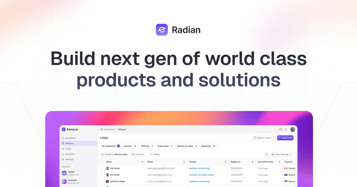
Radian is an open-source UI kit and React development library that keeps design and code in sync. Build consistent interfaces using production-ready components and tokens that map directly to real code.
Radian OS is an open-source, high-quality UI kit and React development library built using React, Radix, and Tailwind CSS. It is designed for developers and designers who want to build next-generation world-class products and solutions. Its core value lies in keeping design and code in perfect sync by providing production-ready components and design tokens that map directly to real code. This React UI kit ensures consistency and speed, allowing teams to rapidly create polished interfaces without sacrificing quality.
The primary pain point Radian OS addresses is the fragmentation between design and development that often leads to inconsistent interfaces and costly rework. Many teams struggle to maintain a unified design system across projects, resulting in visual drift and wasted effort. Radian eliminates this by offering a design system built for speed, scale, and simplicity. With high-quality base components, animations, and reusable blocks, teams can instantly leverage production-ready assets. This matters because it removes the need to rebuild common UI patterns from scratch and guarantees pixel-perfect consistency between Figma mockups and the final React application.
The first major feature group is High Quality Base Components. These are solid, reusable components built with attention to detail and best practices. Developers can install them via a single CLI command (‘npx radianui@latest init --next’) or simply copy and paste the snippet. No configuration or waiting is required. The library includes a wide array of components such as Button, Input, Checkbox, Dialog, Dropdown, Sonner (toast), Tabs, Table, and many more, each with multiple variants. These components are fully customizable and designed to work out of the box, accelerating the workflow for building anything from simple forms to complex dashboards.
The second major feature is the Themeable System and Design Tokens. Radian OS allows users to edit a single token to restyle the entire design system across light, dark, or custom themes. The system includes a Figma variable system for managing consistent design tokens across color, spacing, and typography. This means designers can define a palette and typography scale in Figma, and developers can mirror those exactly in code. Auto layout capabilities further enhance flexibility, while responsive typography ensures text remains legible on any device. Theme Modes and color presets enable effortless switching between visual contexts, maintaining brand harmony.
Publisher
A
admin
Launch Date2026-02-05
Platformweb
Pricingfree
Tech Stack
#React#Radix#Tailwind#TypeScript#Next.js
Domain Authority
Ahrefs DR0/100
Traffic Insights
Month2026-01
Estimated Visits0
MoM Visits GrowthN/A(+0)
Avg Time on Site